
Go beyond cookie cutter

WORDPRESS WEBSITE DESIGN

A company will spend all their energy perfecting the functionality of their website. And yet, most users base their first impression principally on the design.
In a digital world filled with off-the-shelf online experiences, a custom designed website can cut through the noise.

Tailored designs help your website engage users and drive conversions.

Tailored Web Design

Your brand and organizational personality drive your website design. Whether you are giving a refresh to your online brand presence or you have an existing brand guide, we work within your branding to tell your story through every element of our design.

We work within your branding to tell your story

Our design team always starts with multiple unique design concepts for your new home page. We start with wide design options, ranging from more traditional layouts to alternatives that can help you stand out. We work with you to refine and iterate until we find what matches your business goals.

Start wide and refine to match your business

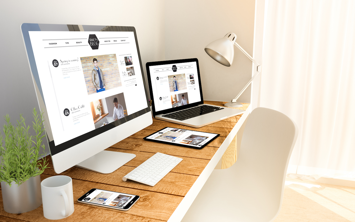
Responsive Web Design (RWD) is now a requirement for all websites. Your website and application needs to be able to function smoothly on any screen size, platform, and orientation. 

All of our sites are built fully optimized for mobile users

Information architecture (IA) is how we organize and arrange the content on websites or applications so that the user can understand without too much effort. Ultimately, engaging UI design and fascinating content can still fail to provide a good user experience without the appropriate information architecture. We build IA into the ground floor of all our solutions, carefully considering your target audience and product or service details.

We build IA into the ground floor of all our solutions

High-quality user interface for both web and mobile goes beyond resizing images or screen resolutions. Our designers work with our development team to ensure any design recommendations or mockups can look pixel perfect in the platform being utilized, whether that is WordPress or WooCommerce.

Providing the optimal experience, no matter the context.

Animated user interface elements can highlight UI design elements better than static text. However, these elements should enhance the user experience by helping guide user flow, not just attract attention. Smart animation strategy prioritizes functionality, not distraction, making sure that all design choices work cohesively toward the overarching goal.

Highlight design elements and engage users

Frequently Asked Questions

Most users form their first impression of your store based on its design, which directly impacts trust, engagement, and conversion rates. A professionally designed WooCommerce store communicates credibility and guides visitors toward purchasing. Inspry’s design team creates custom WordPress and WooCommerce designs that go beyond cookie-cutter templates to make your brand stand out.

Web design focuses on the visual layout, user experience, branding, and how customers interact with your store. Web development turns those designs into functional code. Inspry handles both under one roof, which means your design vision is executed precisely by the same team that created it, with no gaps lost in translation between a design agency and a separate developer.

Yes, we redesign existing WordPress and WooCommerce sites regularly. A redesign can update your store’s visual identity, improve user experience, increase conversion rates, and modernize your site for current web standards. Inspry preserves your existing content, products, and SEO equity during the redesign process.

A tailored design helps your website engage users and drive conversions by creating intuitive navigation, clear calls to action, and a visual hierarchy that guides shoppers to purchase. Off-the-shelf themes force you into a generic layout that may not align with your products or audience. Inspry designs custom experiences that are tested and optimized for your specific customer journey.

Yes, every WooCommerce store Inspry designs is fully responsive across phones, tablets, and desktops. With the majority of e-commerce traffic coming from mobile devices, responsive design is not optional. We test across multiple devices and screen sizes to ensure a seamless shopping experience for all of your customers.

Inspry works with multiple design and page building approaches depending on the project, including the native WordPress block editor, Beaver Builder, and custom theme development. We choose the best tool for each client’s needs, balancing ease of use for content management with performance and design flexibility.

Need design advice?
Let’s talk.

Contact us to book a free, no-obligation consultation.